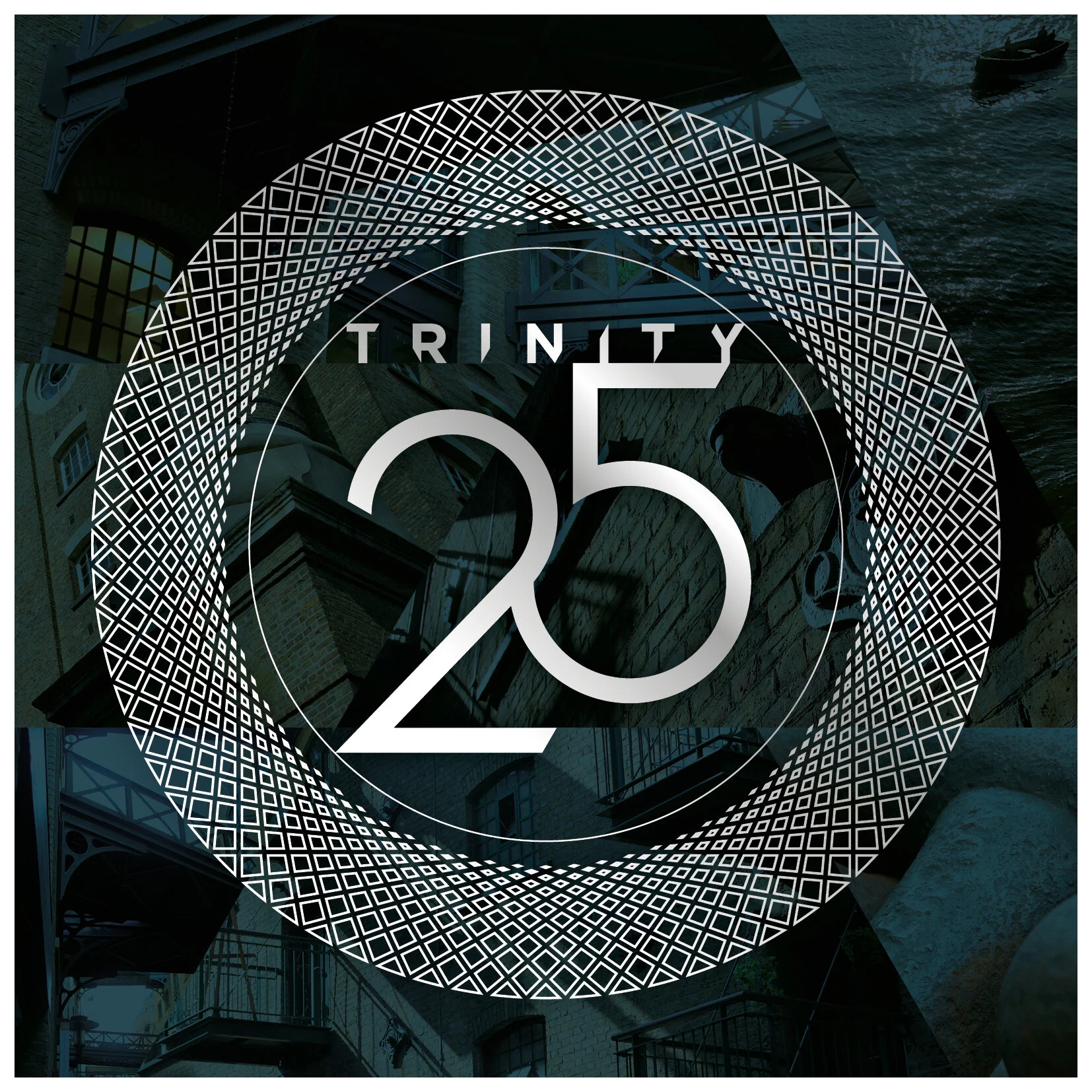


Drinks company, Spirit of Bermondsey, wanted an identity for its launch product, ‘Trinity 25’, a name derived from its alcohol content and its key three ingredients, and sold as a lighter alternative to gin.
The company was keen to promote the heritage of its location, the historic Victorian London docklands but using contemporary styling. With this in mind, I created the Trinity ‘halo’ that was used to encapsulate the name. This was inspired by the ornate ironwork found in the Victorian buildings around Shad Thames. The ‘halo’ overlayed a triangular mosaic. These assets were used across all promotional material.